B2B | Deep Tech Startup | Web Design
UX Capstone x NanoMorphix

Introduction
Building the material that makes armor invisible and self-healing
NanoMorphix is an advanced materials startup founded in 2024 by PhDs from the University of Toronto. The company develops transparent, self-healing coatings for high-energy impact protection in defense and aerospace applications.
For a company at this stage, the website is not a marketing asset. It is the primary channel through which potential investors, industry partners, and collaborators form a first impression, assess credibility, and decide whether to take the next step.
NanoMorphix had a compelling story. The technology was advanced, the team was credentialed, the institutional backing was real. The website just hadn't caught up to any of it yet.

Original website home page
My Role
What I Was Responsible For
I led the research phase. That meant planning and running 4 stakeholder interviews, conducting competitive analysis across 6 companies, comparing 6 website builder platforms, and synthesizing everything into the framework that structured the project from that point forward.
Diagnosing the problem
Visitors left without a clear picture of what NanoMorphix offers
Research sessions consistently showed the same pattern. Visitors arrived at the site, spent time with it, and left without understanding what NanoMorphix does, who it serves, or why its technology was worth their attention.
The substance was there. Strong technology, real institutional credibility, quantifiable performance data. The site just hadn't found a way to surface any of it yet. Research revealed four specific places where that gap showed up.
The Challenge
Redesign the website so that a first-time visitor understands what NanoMorphix offers, trusts the company behind it, and knows exactly what to do next.
Design principles
Constraints
Things we designed our way around
Discovery
1. Secondary Research
It covered heuristic evaluation of the existing site, competitive analysis across 6 B2B deep-tech companies, and a comparison of 6 website builder platforms. The competitive analysis was particularly useful.
PPG Industrial Coatings, Transparent Armor Solutions, and Waterloo Alchemy all showed the same pattern: credibility surfaced immediately, performance data led the product story, and calls to action were specific and recurring throughout.
Heuristic Evalutation

Competitor Analysis

2. Primary Research
4 stakeholder interviews with a commercialization specialist, a startup project manager, a pitch competition peer, and a startup mentor were conducted. Each session ran approximately 25 minutes and included an impression test followed by structured questions about how they evaluate startups and what builds trust in a first visit.
“I would click through all the navigation tabs and mainly focus on understanding what the product does”
Participant 4
“I think the list of sponsors makes me trust them a little more, even though I've never heard of them”
Participant 2
“Within the first 30 seconds, I did not clearly understand what the product is used for or its real-world applications. The information felt limited.”
Participant 3
Research Synthesis
1. Data Analysis
Affinity Diagram & Prioritization Matrix
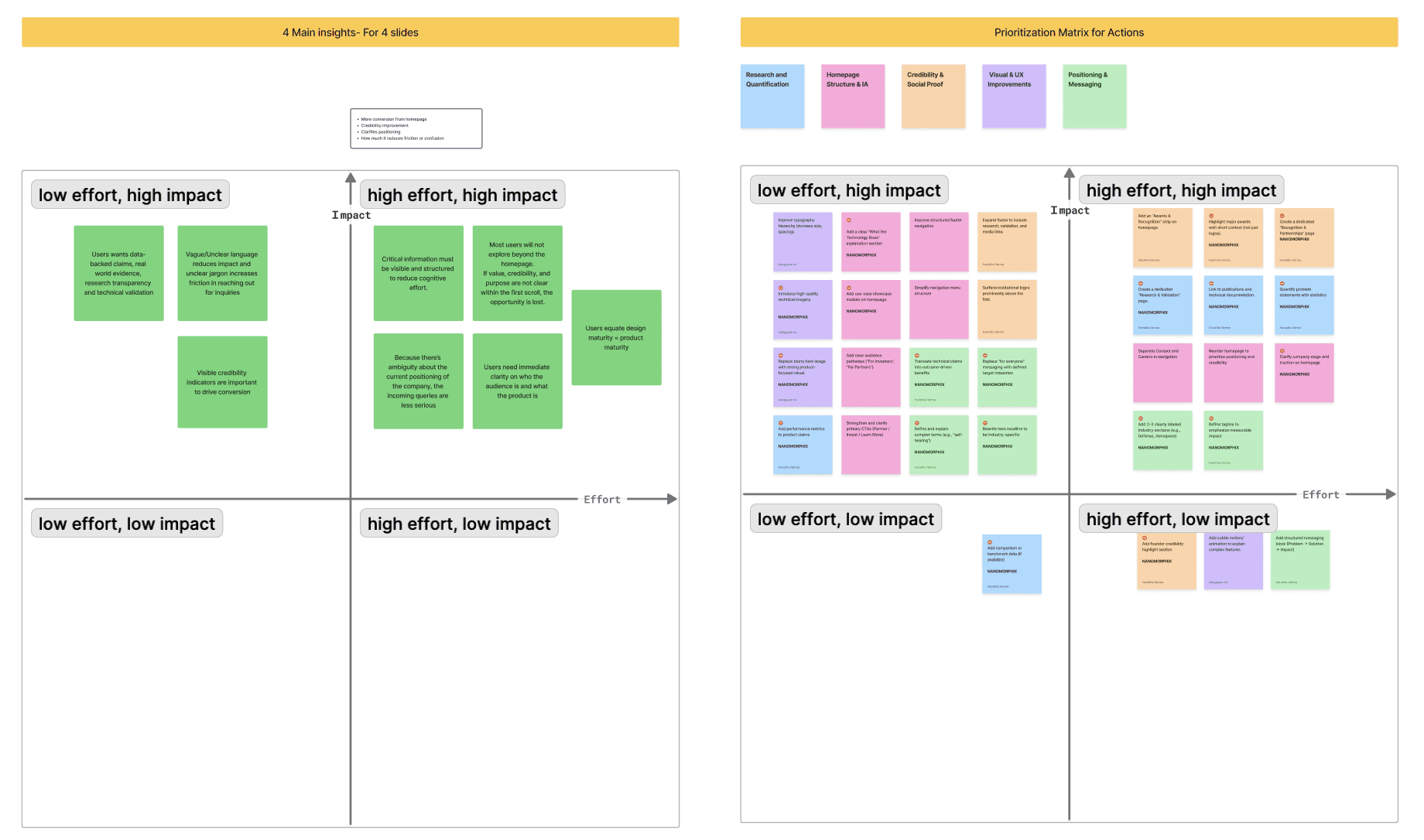
Using an affinity diagram, we identified 6 main themes during interviews which revealed 8 consistent patterns in user expectations and translated insights into actionable tasks. Then using a prioritization matrix Identified 16 high-impact, low-effort opportunities as immediate priorities along with some structural changes.

2. Four main insights
The synthesis produced four findings. Each one became a direct design decision.
Insight
Positioning not yet on the page
Decision
Restructure the IA to give positioning a clear home
Insight
Credibility present but not prominent
Decision
Restructure the IA to give positioning a clear home
Insight
Performance data had no home
Decision
Create a Technology page built around product proof
Insight
Imagery communicating presence, not product
Decision
Replace every decorative image with one that explains
Decision 1
A structure built around how partners actually evaluate companies
What Research Showed
Visitors had no path through the existing site. With only 3 pages — Home, About Us, News — and one interactive button, there was no dedicated space for product information and no way for different user types to take a relevant next step.
“I would click through all the navigation tabs and mainly focus on understanding what the product does.”
Participant 4
New Information Architecture
The original website had 3 pages, with one CTA. Different versions of Information Architecture were tested and validated by users in testing sessions.

The decision
We drafted 6 versions of the information architecture before landing on a 4-section structure: Home, Technology, About Us, News. The sequence mirrors how a potential partner actually evaluates a company. The Technology page was entirely new. Creating it was the most direct response to research showing that visitors had no product information to work with.

Why this and not another
We considered consolidating technology content onto the homepage, but research showed that partners needed a dedicated space they could return to and share internally. Compressing that content into the homepage would have served casual visitors, not evaluators.
Decision 2
Bringing the credibility to the surface
What Research Showed
NanoMorphix had real credibility signals like University of Toronto affiliations, sponsor logos, industry backing. These were on the site. They were just positioned where a first-time visitor was unlikely to reach them. 4 of 4 interview participants could not identify NanoMorphix's institutional affiliations based on their first visit to the homepage.
Performance data had the same problem. Greater than 70% light transmittance, 491 m/s blast-proof, 99% UV-protective, 100% self-healing — none of it surfaced in a form that a technical partner could use to make a quick assessment.
“I think the list of sponsors makes me trust them a little more, even though I've never heard of them.”
Participant 1
The decision
The Partners and Sponsors section moved to the homepage and was given a permanent, prominent position. Performance metrics were pulled out of body text and presented as large visual stat callouts — accessible within the first scroll, without any searching.

Decision 3
Giving the product the home it had earned
What Research Showed
10 separate comments during discovery identified missing product information as the most significant gap on the site. Visitors arrived ready to evaluate the technology. The site hadn't yet given them the space to do that.
“Within the first 30 seconds, I did not clearly understand what the product is used for or its real-world applications. The information felt limited.”
Participant 3
The decision
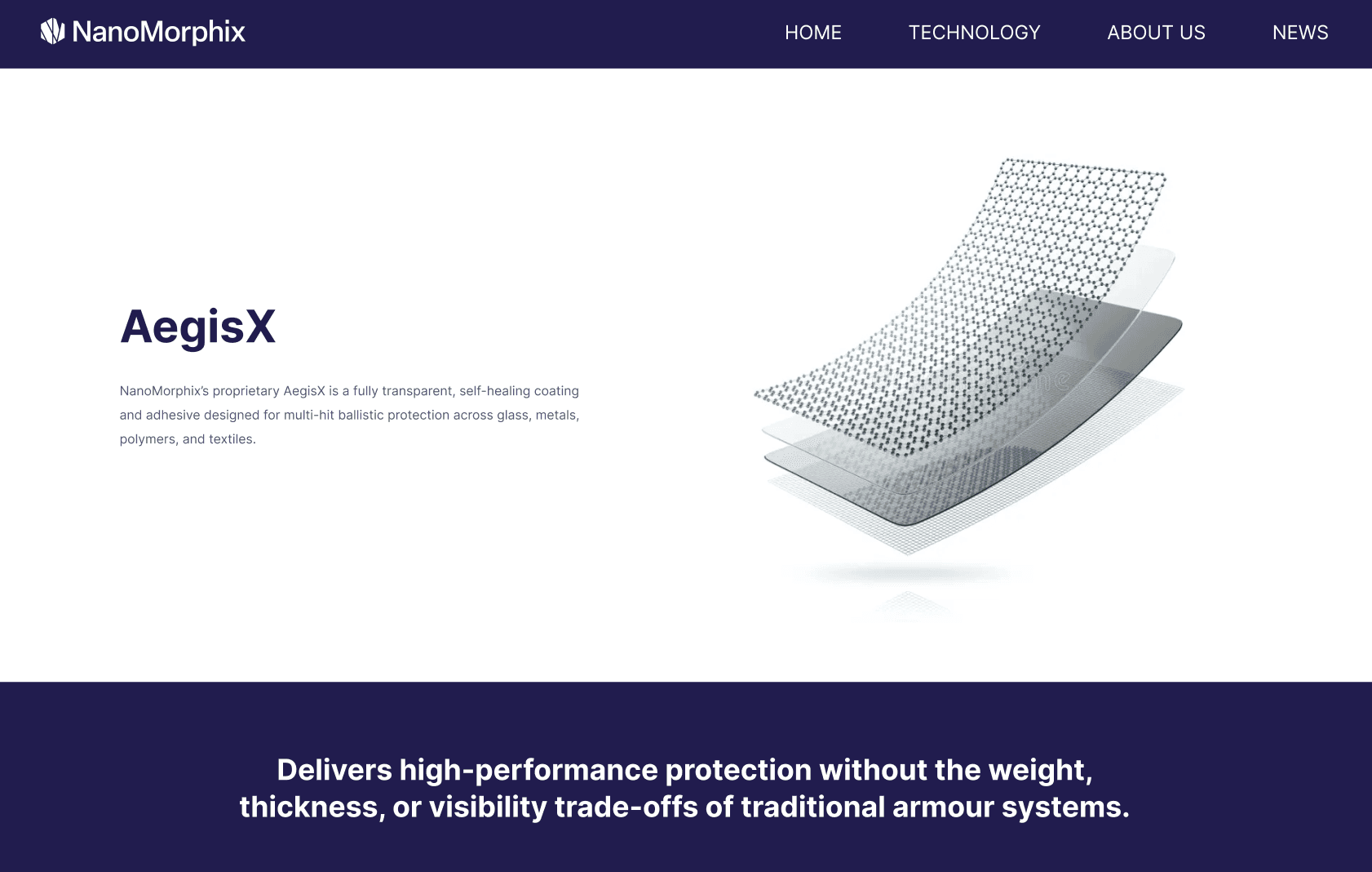
The Technology page was designed to take a visitor from initial curiosity to confident comprehension within a single scroll. It opens by naming the product — AegisX — with a product render and one plain statement of its core advantage before any technical detail.
Working around the patent constraint
Some of the most compelling technical details were off limits during the project. The page was designed to communicate value at the right level of abstraction : specific enough to be credible, general enough to stay within IP bounds.
Decision 4
Visuals that explain, not just illustrate
What Research Showed
13 distinct user comments during discovery described the existing photography as hard to connect to the technology itself. The images communicated that a company existed. They didn't communicate what the company did or why it mattered.
“That's a very blurry image. You can't really tell what it's doing or what it is.”
Participant 3
The decision
Every decorative image was replaced with imagery that explains. The guiding principle: if an image doesn't explain something, it doesn't belong on the page.

Home Page (Before)

Home Page (After)
Usability Testing
6 moderated testing sessions
A first impression test followed by 9 structured tasks across all 4 pages, then a SUS questionnaire and product reaction form. Participants were 23 to 25, from STEM-adjacent disciplines, with moderate to high comfort navigating information-dense interfaces — a reasonable proxy for NanoMorphix's technically literate B2B audience.
The restructured information hierarchy supported scannability without instruction from the very first session. Participants moved through the pages in the intended sequence. Informative visuals were the most consistently praised change.
What we refined based on feedback
Final Designs
Designed to be easily implemented in GoDaddy
All four pages were designed to work within GoDaddy's website builder, keeping layouts clean, components simple, and content structured in ways the platform could support without custom development.
Outcome
What we delivered. What the client said.
“We love the redesign, it's clean, the decisions are clear, and it actually shows us how to position ourselves better in front of investors and partners. It's also straightforward enough that we can implement it in GoDaddy without needing a developer.”
Nicole Cheung · Chief Administrative Officer
What we delivered
Finalized website redesign
New information architecture
High-fidelity designs for all key pages
Content and CTA strategy
What we planned but couldn't complete
Deployment on GoDaddy
The client decided to shift platfroms and handle implementation internally
Impact
Delivered platfrom-ready designs adaptable to any builder
Provided a strong foundation for future implementation and scaling

